Work begins on a beautiful new font for Liverpool Parish Church
Our latest ecclesiastical project for Liverpool Parish Church takes inspiration from a font we designed and made for Christ the King in Battyeford and adopts a similar creative approach, bringing together a number of talented and passionate artisans.
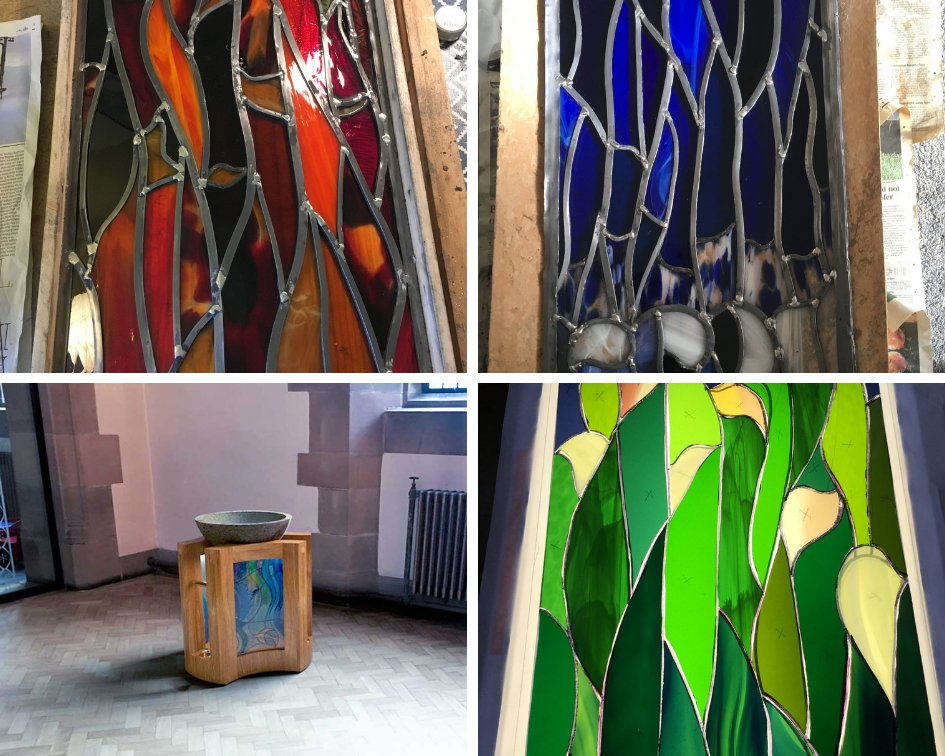
One of the makers involved is Liverpool glass artist Katharine Bayes who has created a special stained glass design for the font that tells the story of the church, its location, its heritage and its current role in the community. Katharine has designed a number of glass panels for churches and homes and has a unique style and ability to interpret ideas in a striking and abstract way.
She is creating three panels to represent the Holy Trinity which will include green leaves to represent the Father and creator, red and orange flames for the Son and a blue cascading waterfall for the Holy Spirit.
We have enjoyed watching her designs take shape alongside our own and can’t wait to see the two brought together.
During the design process we have given careful consideration to the font’s setting, not just in the way we have interpreted the architectural style of the building in our work but also by thinking carefully about how it will function within the church. The fact that it will be in a shaded part of the church has led us to consider how best to highlight Katharine’s stunning and intricate work. For this reason we have incorporated concealed lighting which will illuminate the stained glass work. The angle of the lighting is very important if we are to achieve the right effect and we used many different renders to test out the best positioning.
The font bowl will be cut from Yorkshire stone by Hillhouse edge quarries in Holmfirth who are expert masons and have carried out many interesting projects including supplying the stone for the Welcome to Yorkshire garden at this year’s Chelsea Flower Show.
It is such a pleasure to work with such talented crafts people and we are also enjoying being part of the wonderful team at Liverpool Parish Church. They had seen our other ecclesiastical work, particularly our font for Christ the King, and asked us to develop a font design that would complement the style of the church. The setting for this font is very different to that of Christ the King and for this reason we have chosen to use oak for this design. We are also adding some brass rails. We have customised our previous font design to suit their needs and we are pleased that this project will make full use of our new 5-axis CNC machine.
We will be sharing more news on this project as it takes shape. To follow its progress visit @glasslandscape on Facebook where Katharine is sharing images of the glass panels in development and follow @dovetailors on Facebook and @dovetailorsfurniture on Instagram to see the whole piece come together.